Tuesday 16 August 2016

Coombe Beauchamp Apples

The other weekend we had tea in the orchard of our friends the Macdonalds. It is a magical corner of Herefordshire where Angus grows old varieties of local apples which are pressed into apple juice each autumn. 


His enthusiasm and attention to detail carries through from the choice and care of the apple trees, and the surrounding wild flower hay meadow; to the labels on the green glass bottles.


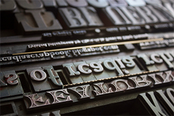
The Coombe Beauchamp labels are printed by Tilley's - a traditional letterpress printers based in nearby Ledbury since 1875. The large golden letters spelling out Apple are printed with wooden type and the rest of the text is over-printed with old metal type. All the labels are glued by hand onto the bottles and boxes - no self adhesive short-cuts here.


The new season's fruit were just ripening when we visited, and underneath and around the trees is a wonderful wild flower hay meadow full of yellow rattle and vetches. 


For more details on the juice please contact Angus Macdonald - angusmacdonald@talktalk.net

You can see more about Tilley's on their website here

Wednesday 10 August 2016

Neri & Hu for De La Espada

We were delighted to have our Sourdough blanket used in this shoot by De La Espada. The furniture is by Neri & Hu for De La Espada. It was shot in Portugal with styling by Simon Kampfer and photography by Yuki Sugiura. 


Thursday 4 August 2016

Isokon Plus

I had a wonderful morning this week at the Isokon Plus workshop.

I really love working spaces - with all their particular sounds and smells.


These above are the Bodleian library chairs in the making. They were commissioned for the famous library in Oxford with the design by Barber Osgerby and the production by Isokon Plus. The chair is beautiful and distinctive - perfect for the Bodleian.


I find myself very drawn to the aesthetic of industrial machinery - the particular hammerite green above feels very familiar and I love it against the bright yellow and red.

These below are sanding belts hanging up on long wall pegs.


You can see here the iconic Isokon plus Penguin donkey. I think these must be the original birch ply ones designed by Egon Riss in 1939. 


I love the sinuous feel of the Bodleian chairs all stacked up - they feel like the spine and rib cage of a whale.


Isokon Plus are a wonderful company with a fascinating history and we are really looking forward to working with them. You can see more about Isokon Plus on their website here.

Thursday 21 July 2016

Le Corbusier - Unite d'habitation


Last month we had a wonderful weekend away in Marseilles. It is a great city, and undoubtedly for me one of the highlights was Le Corbusier's Unite d'habitation.  


The project was built between 1947 and 1952, and I was really struck by how well it has stood the tests of time and the scrutiny of its ideals - the democracy of design, the honesty of materials and the beauty of functionalism.


I love all the concrete forms, with the original wooden shuttering clearly visible.

But I was also really surprised by all the decorative detail - in the image above you can see a pattern of coloured tiles on the roof terrace. 


And the strong, thoughtful use of colour throughout the building works wonderfully against the greys of the concrete

Maybe this was partly due to the influence of his collaborator the painter-architect Nadir Afonso. But whatever the reason, it works wonderfully to soften the edges of this beautiful brutalist icon.


Thursday 19 May 2016

Iris Hantverk

You may already know or even own one of more of Iris Hantverk's beautiful brushes - they are sold in discerning design and homeware stores throughout the world. 


The company was first set up in the late nineteenth century to provide employment for visually impaired craftsmen. To this day Iris Hantverk continues to work with highly skilled visually impaired craftsmen in Sweden and Estonia. 

The traditional techniques of hand-drawing and binding are still used today resulting in brushes that feel both beautiful and functional.


The brushes are made from a amazing array of materials including agave leaf fibre, sago palm leaf fibre and goat hair. There is lots of great information on Iris Hantverk's website about all the materials and their specific properties


We are very pleased that Iris Hantverk stock our blankets in their Stockholm flagship store - to us they feel like real kindred spirits. 

For more information about Iris Hantverk and their beautiful brushes have a look at their website.

The wonderful photos above are all by Anna Kern


Tuesday 10 May 2016

Assyrian Lion Hunt

We were in the British Museum the other day when I came across these extraordinary low-relief carvings from Nineveh.

Although I am familiar with the big gates from Nimrod in the museum these 'lion hunt' stone panels were a real revelation.


The carvings date from 645 - 635BC and lined a chamber in the North Palace at Nineveh.

The palace was built for King Ashurbanipal. Although a keen sportsman, rather than hunting lions in the wild, Ashurbanipal had them rounded up and brought to an arena where he could shoot them down one by one. The staged hunt must have been a real spectacle and testament to his power and authority.


What I find really extraordinary about the carvings is that while the people in the images remain very stylized - always shown in profile and with no expression on their faces, the dying lions are depicted with an intense realism and - to my eye at least - an empathy for their suffering. You can clearly see the pain in their snarled and furrowed muzzles. 


Perhaps there were strict rules and conventions about how humans could be depicted, whilst the sculptors were left to interpret the animals in a much freer way.

Whatever the truth, if you have a spare fifteen minutes in the British museum they are well worth a visit.


Friday 11 March 2016

End and End

Almost all of our fabrics are double-cloths. This means that the fabric is made up of two distinctly separate but interlocking layres. I love using this technique because it allows for very sharp graphic patterns.


The warps we use for double-cloth are called 'end and end' - the literally means one yarn of one colour and the next of another. We use end and end warps for all our patterned upholstery fabrics. You can see in the image above the warps for our Bilsdale, Heathfield and Mendip fabrics - made up of alternating threads of white and grey. This warp has finished weaving and you can see underneath the warp for the Totley and Belmont which is 'end and end' orange and white.


Our upholstery fabrics are all made on the same threading set-up which means that one warp can follow on from the next on the loom. New warps are knotted onto the end of the old one - as you can see above at the start of the warp for the Ashkirk and Chillerton.


The blue and white warp above is the end and end warp for our Wrekin, Rowridge, Caradon and Wharncliffe fabrics. Of course the warp is only half the story as far as colour and pattern - once you add in different weft yarn colours and different lifting patterns the possibilities are infinite.


The weaver in the image above is preparing the orange and white warp for tying on - you can see the distinct groups of yarns created through sectional warping. 

And the image below is of the very clever magical machine that ties each thread from the end of one warp onto the beginning of the next.


I really like the way that this stage - before any weft goes is woven in - the warps are so linear. I guess literally the threads are only going in one direction. The effects on the loom as as one set of threads emerge through the other is like that of Ikat. Beautiful

Thanks to Catherine at Bute for the wonderful photos.