
Tuesday 22 December 2015
Wednesday 16 December 2015
Elliott Ceramics

Our friend Elliott has just recently launched his first ceramics range. The work is beautiful. Wonderful spare considered shapes in delicious ice cream colours.
The pieces feel lovely to use - they sit well in your hand, and the little fleks of colour and texture add a touch of grit to keep them just the right side of sugary.
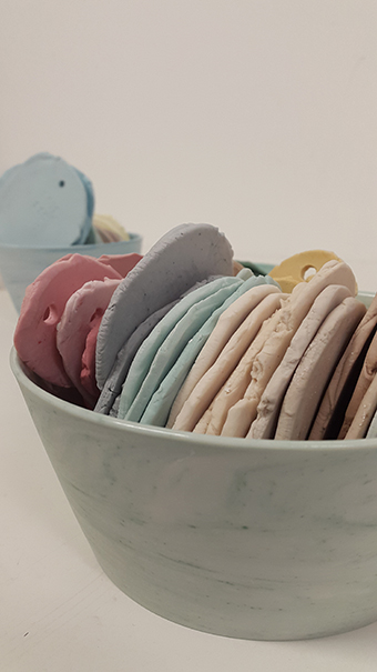
These are colour samples for the porcelain - stacked up here they look like delicious marzipan in hazlenut, raspberry, mint and oatmeal. You can see more of Elliott's work here.
Thursday 10 December 2015
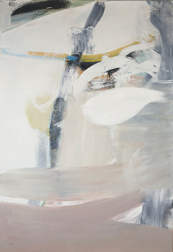
Peter Lanyon - Soaring Flight
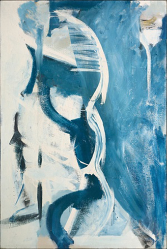
I went recently to the Peter Layon show at the Courtauld. The exhibition called 'Soaring Flight' focuses on Layon's later gliding paintings. The painting above is a aerial view of the coast. This one seems quite explicit - many of the other paintings are quite abstracted, with suggestions of the route of the glider's journey as well as references to the elements in the air - thermals, and clouds.
Tuesday 24 November 2015
Sfera preview

Went last week to the Sfera preview in Clerkenwell. As always with Sfera's work, every piece was exquisite and it was a lovely chance to see the full range of materials including porcelain and stoneware; copper and aluminium; wood, bamboo and glass.
I was particularly drawn to the two collections which mixed ceramic and basketry collections - like the vessel above.

The affinity with materials and processes is so strong throughout the collection, and the attention to detail carries through to every last stem. Delicious.

Wednesday 18 November 2015
In the Press

We are very pleased to have been invited by Monocle magazine to design and produce a pair of exclusive blankets for their shop. The result is a clean pared-back design of white bars floating in a pick and pick ground on one face with a chequer patterned reverse face.

We were also very pleased to have our Quince, Quail's Egg, Easterly and Sandstone Optic blankets included in Modern Rustic's 'Objects of Desire' series.
And we are also delighted to be included in the forthcoming issue of Midcentury Magazine - 'the UK publication for all things Mdcentury Modern, championing the best of mid-20th Century interiors, furniture, architecture and design.'

Friday 30 October 2015
Swing Tags

Very excited about our new swing tags. Once again Victory Press, who do all of our printed graphics, have come up trumps.

There is something so satisfying about them all stacked up in the box with the strings all tied up beautifully.

The lettering is done with foiling, and the pattern is blind de-bossed into the card. It feels almost as though the pattern is bitten into the card. The technique gives a wonderful texture - so much more interesting than flat litho or digital printing.

Wednesday 23 September 2015
Slate Headstones of Cornwall

We are just back from a couple of days down on the north Cornwall coast. It was glorious late summer weather and we did a long walk along the cliff tops. Right at the end we came across the churchyard at Padstow.
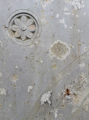
The churchyard is full of the most beautiful slate headstones. The patterns are very free flowing and delicate - like these beautiful oak leaves above.
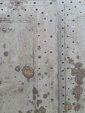
Most of them are 18th and 19th century and many are the memorial stones for 'master mariners'. It shows how very connected people's lives were with the sea.
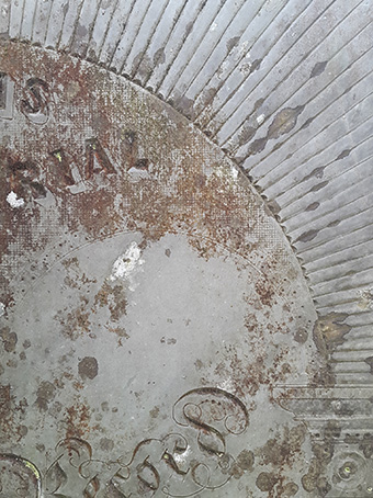
Many of the stones look almost like samplers for lettering styles, with the text varying from ornate gothic on one line to copperplate on the next. A glorious celebration of fonts and styles.

I remember years ago coming across the gravestone of John Betjeman in St Enodoc's church midway between Polzeath and Rock - just across the water from Padstow. It is very much in this style - a beautiful free-flowing lyrical design delicately traced in dark Cornish slate. Good to see that the tradition continues.
Sunday 30 August 2015
Pick & Pick + End & End
Earlier this summer, as part of the new additions to our Aerial upholstery collection we launched four new pick & pick 'grounds'. These are single-cloths which co-ordinate with the background colours and textures in our patterned double-cloth fabrics. Quieter cousins to the double-cloths, the grounds are establishing themselves as beautiful versatile fabrics in their own right and we have a number of exciting projects in the pipeline.

We often use these techniques to create mixed colours as in the upholstery grounds above. It is a lovely way to mix colour in a quite deliberate and graphic way - you get great depth of colour whilst always still reading the individual yarns in the mix.

In the 2/8ths blankets we have used end & end against solid colour to achieve the visual break between the top 'boarder' of the blanket and the main body. You can see the point at which the two effects meet on the fold of the 2/8ths Storm Blue blanket in the stack above. It is a beautiful way to change the feel of the fabric - knocking back colour, adding darker or lighter areas in a graphic way - I think of it as a sort of woven cross-hatching.
Friday 28 August 2015
Barbara Hepworth - Drawings
We went the other day to the Barbara Hepworth show at the Tate. There were lots of beautiful familiar pieces - I particularly loved the huge guarea wood pieces with their beautiful nut-like polished exteriors and their chalky lime-washed textured interiors.


There is a great article by Jonathan Jones from 2012 about the drawings in which he draws the comparison between these and the paintings of Piero della Francesca. You can read the article on the Guardian website here:
http://www.theguardian.com/artanddesign/2012/oct/24/barbara-hepworth-hospital-drawings
Perhaps what struck me most though were the drawings - most of which I had never seen before. I found these studies of surgeons at work really extraordinary. They were made just after the war, when Hepworth had befriended the surgeon Norman Caponer who had treated Hepworth and Nicholson's daughter.
I really love all the scratchy grainy textures in the drawings - for me they have much of the quality of the chalky textures in Hepworth's carving.
http://www.theguardian.com/artanddesign/2012/oct/24/barbara-hepworth-hospital-drawings
Friday 10 July 2015
The Beautiful Shears of Hitch Mylius
Inspired by a lovely post by Hitch Mylius on their website yesterday about the process of making a piece, I have found these images which I took on my last visit to their factory. As you can see, the shears seem to have caught my eye!


For the link to the Hitch Mylius post please copy and paste this: http://www.hitchmylius.co.uk/about/process/
Thursday 2 July 2015
Sfera - kid's furniture
We were delighted when Sfera used our Aerial fabric once more - this time on their beautiful children's furniture range. The collection is absolutely charming - as you can see below.
The furniture is a collaboration between designer Shigero Mashiro and master woodworker Naomi Tado and was launched at Milan this year.


You can read more about the collaboration on Sfera's magazine pages here.
Wednesday 1 July 2015
RAF Hendon
I was going through old images the other day and came across these from RAF Hendon. It is a wonderful museum of old aeroplanes. Some of the earliest have wooden framed wings with linen stretched over them - amazing how fragile they seem.
I really like all the markings and colours, and particularly how these crisp graphics work against the riveted metal panels. Beautiful.


Monday 22 June 2015


Friday 5 June 2015
Richard Diebenkorn

In fact when I got to the show I found that it was his mid-career figurative works that spoke most to me. I find the sense that the landscapes above and below are both flattened and contoured very interesting, and I love the sense of light and shadow. You can anticipate the clean abstraction of his later paintings, but it is the detail and the specificness of the landscape which make these so wonderful.

Perhaps my favourite paining of the show was this one of a knife in a glass of water. Again you can see some of the qualities of his later abstraction - the flattened planes of colour and clean lines and shapes - but it is the weighty realness of the objects that most appeals to me.

Tuesday 2 June 2015
Pleasing patterns
Here are some nice examples of patterning in architectural details I have spotted recently.


From top: Smithfields market, Clapton Methodist church, Smithfields stall roller,outside Temple underground station, Smithfields market,
Subscribe to:
Posts (Atom)